Quiet Moments Bathroom
Benjamin Moore Quiet Moments

Benjamin Moore Quiet Moments 1563
Today's favorite color is Benjamin Moore Quiet Moments, #1563. It's one of my very favorites.
This post contains affiliate links for your convenience. If a purchase is made after clicking one of the links I might make a small commission. Your price does not change. For full disclosure, go here
What color is Quiet Moments?
Quiet Moments is a very soft, muted gray with a hint of blue and a tiny touch of green. One of Benjamin Moore's most popular colors, here's what one pinner says about it:
"My favorite color ever. The outcome depends on many factors such as lighting and wood tones in the room. This color also takes on undertones from fabrics in the room. In my bathroom it looks suede blue but in my living room it looks like dull seafoam."

What rooms look good painted with Quiet Moments?
With its subtle undertones, Quiet Moments can be used in any room in your home, but it looks especially nice in bedrooms and bathrooms. It has a calming, peaceful vibe that can provide a spa-like atmosphere which is perfect for those areas.
Tips for choosing your paint colors:
- Look for inspiration on pinterest, instagram, or in home magazines
- Once you've decided on the direction you want to go, narrow your choices down to 5 or less, ideally.
- Keep in mind that paint colors will look more intense on your walls than they do on paint color strips with multiple shades.
- Look at the color you're considering in the room that you will be painting, not outside in the bright sun.
- See how the paint color looks in that room during different lighting situations...on a sunny day, on a cloudy day, with and without the lights on, and at night. They look different in each of these situations.
- I strongly recommend testing the color either by painting areas of the room (next to the trim) or by using a peel and stick paint samples. You can get one here: Benjamin Moore Quiet Moments Peel and Stick Paint Sample

In this classically styled bathroom, Quiet Moments beautifully complements the Carrera marble and white porcelain elements. It works nicely with the gray undertones as well as the warmer ones in the draperies. And the nickel cabinet hardware and towel bars look perfect with it.

Above: Design by Brittany Nixon Brun, Brittany Nixon Creative. Paint color: Benjamin Moore's "Quiet Moments." Photo by Rett Peek
Quiet Moments is a great color choice for bedrooms. In the above room, the wood tones, fabrics, and trim all work together beautifully to create a calming, serene space that's very desirable in any bedroom.

houzz - Elms Interior Design
In this more casual bedroom, the warm wood tones, white trim, and gray accents have a classic look that will never go out of style. It's fresh and relaxing and looks like the perfect place to unwind after a long day.

In this image, you can see how the paint looks lighter on a bright and sunny day. It still looks beautiful and the accents are perfect with the color.

Give your dining room a classic and elegant aura by painting the walls with Quiet Moments. It works for all seasons and with any design style.
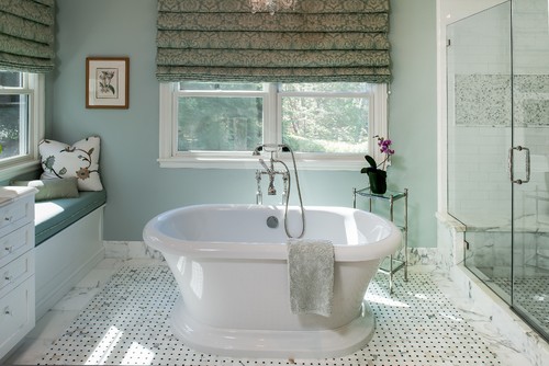
Douglah Designs
For a refreshing bathroom, Quiet Moments is a great paint color choice. It's soft and elegant and looks wonderful with the crisp white trim paint and bathtub.
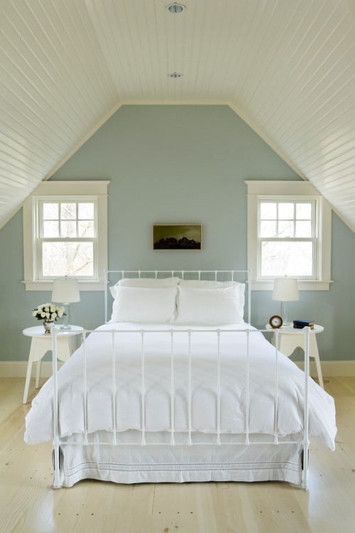
Who doesn't want Quiet Moments in the bedroom? It pairs nicely with the cottage-y whites in this serene room.

The Quiet Moment walls are the perfect complement to the warm wood floors and white trim in this remodeled kitchen and eating area from The Idea Room.
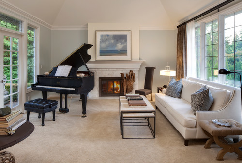
In this living room it takes on a more sophisticated look with the black piano and sleek furnishings.
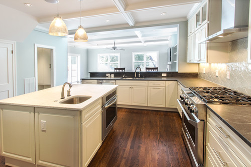
This traditional kitchen is gorgeous. I love the dark wood floors and the Moroccan looking tiles on the back-splash. The Quiet Moments doesn't overwhelm the room but instead makes a nice subtle backdrop for all of the other items in the space.
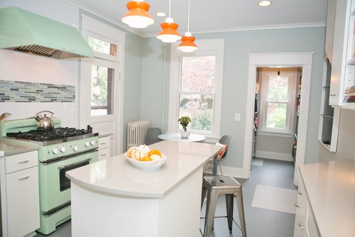
Eclectic Kitchen by Frederick Interior Designers & Decorators Meredith Ericksen
This kitchen is such a fun and lively space with the mint green, vintage-looking stove. And the orange lights add just the right pop of color. Again, the Quiet Moments is a nice subtle backdrop for everything else going on in the space.

And last but not least, here it is used inside of our home office closet that we recently transformed. The trim color is Benjamin Moore Soft Chamois. You can go here to see more of that space.
What trim color goes with Quiet Moments?
I often get emails from readers wanting to know what trim colors work with various wall paint colors. Here are my favorite trim colors to use with Quiet Moments:
- White Dove
- Cloud White
- Linen White
- China White
What are some complementary colors that work with Quiet Moments?
If you're interested in seeing some companion colors that blend with Quiet Moments, take a look at these:
- Dune Grass
- Rose Accent
- Buttermilk
- Natural Linen
So what do you think of this color?Would you use it in a bedroom, bathroom, kitchen, anywhere?
As with any color, always try a sample first. And never choose a color based on a photo seen on a computer. Lighting and editing as well as screen setting in online images may make them appear different than they look in reality.
You might find these books helpful in your color selection process.
Thanks so much for dropping by my little space on the world wide web!

Source: https://www.postcardsfromtheridge.com/2013/07/favorite-paint-color-benjamin-moore_23.html


0 Komentar